Scripps wanted to capture the joy and energy of childhood while keeping things clean, legible, and adaptable across a wide range of brand touchpoints. They also wanted to keep a original node to their old logo by incorporating the smile into the logo itself. The new logo is bold and playful, with custom lettering that leans into an inviting, hand-drawn feel—think kid-friendly without looking overly childish. A custom smile graphic was also integrated into the logotype, subtly reinforcing the brand’s core mission and energy. From office signage to website headers and stickers, this logo was built to shine across every medium.
The brand suite includes multiple logo variations, all designed for flexibility across print, web, apparel, and social platforms. From stacked to horizontal versions, color and monochrome adaptations, and circular badge-style marks for small spaces, the brand system is ready to go wherever it needs to live. The type and icon systems were built to reflect both playfulness and professionalism—clean enough to scale, but friendly enough to feel like a warm welcome.

The updated color palette is vibrant and bright, with hues that appeal to children but are easy on the eyes for parents and office staff. Blues, greens, and oranges make up the core brand tones, supported by softer grayscale options for backgrounds and accents. These tones carry across social graphics, merch, apparel, and even potential interior office elements to bring a consistent energy everywhere the brand shows up.

To help Scripps Pediatric Dentistry stand out in a space that's often overly clinical or outdated, a completely custom logotype was created from scratch—crafted to feel both professional and playful. The hand-drawn letterforms add a sense of personality and warmth, while subtle quirks in the typography (like the rounded edges and soft bounce in the baseline) bring a kid-friendly energy that feels approachable without being overly childish.
The logo system was designed with maximum flexibility in mind. Several logo lockups were developed to ensure the brand could maintain a consistent voice across a wide variety of touchpoints—from signage and uniforms to digital avatars and social media graphics. This included:
Each variation was carefully tested against different backgrounds and use cases to ensure clarity, legibility, and impact at all sizes. The consistency of the custom letterforms across all styles reinforces brand recognition while still allowing flexibility for playful adaptation—especially useful in apparel, swag, and on-site signage.
Whether used in its full-color format on marketing materials or simplified for embroidered patches, the logotype and supporting marks deliver a cohesive identity that reflects both the care and character of the practice.
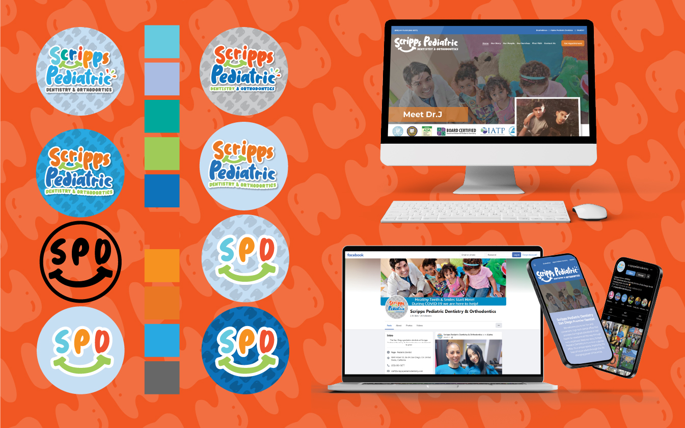
To extend the Scripps brand across digital platforms, a set of circular logo icons was created for use in social media, web favicons, and mobile interfaces. These simplified marks keep the branding recognizable at small sizes and work in both color and one-color formats.
We also designed responsive web mockups to show how the branding comes to life online—clean, welcoming layouts paired with playful color accents and typography. The result is a digital presence that feels modern, professional, and family-friendly.


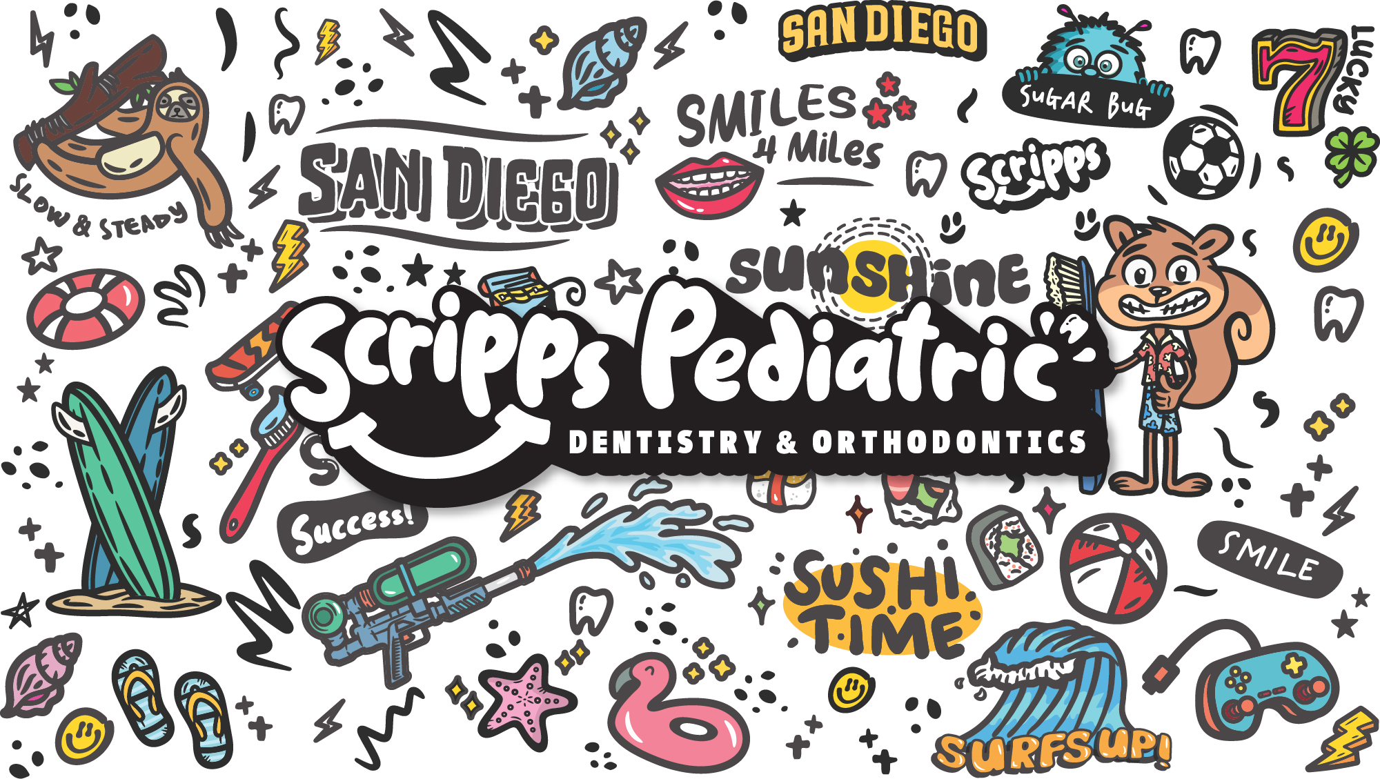
To further personalize the brand and give it a fun, local flair, a full set of custom illustrations was developed to highlight San Diego life through a kid-friendly lens. These playful doodles—featuring everything from beach waves and flip-flops to smiling toothbrushes and game controllers—were designed to turn boring dental visits into something fun and memorable.
These illustrations were also used to create a custom back graphic for staff and patient shirts—turning every little patient into a walking brand ambassador. It’s more than merch—it’s part of the patient experience.

© 2025. deadlydesignco. All rights reserved