Legion of Fun is a SoCal-based lifestyle brand that blends surf culture, nostalgia, and high-energy design into a vibrant identity. I partnered with the team to create a full branding system that captures their playful, rebellious spirit — starting with a bold, expressive logo and extending into a flexible color palette and visual style that pops across platforms. The project included custom-designed merch, apparel graphics, and a line of surf and boogie boards featuring original artwork tailored to their audience. From digital presence to tangible products, every design touchpoint reinforces the brand’s mission to bring the fun wherever it goes.


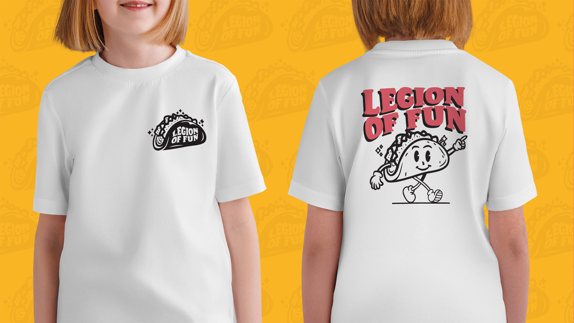
The main goal for this project was to refresh the logo and overall brand system while preserving the quirky taco shape and playful spirit that the owners already loved. I reimagined the identity with bolder typography, a refined illustration, and a more cohesive visual system that could stretch across everything from social media to surfboards. The final result strikes a balance between familiar and fresh — staying true to the original, but with a modern twist that speaks to today’s kids and families.

To match the updated identity and better reflect Legion of Fun’s playful, family-friendly vibe, I developed a new color palette that’s bold, bright, and full of life. The previous color choices felt flat and dated, so we introduced a more dynamic mix of saturated primaries and energetic accent tones that evoke a sense of movement, fun, and creativity. Each color was selected to work well across both digital and physical applications — from social media templates to merch and surfboard graphics — ensuring the brand feels cohesive and recognizable no matter where it shows up. The new palette helps the brand stand out while staying approachable, youthful, and full of that signature fun-first attitude.
Helicha

A bold, playful serif with vintage carnival soul and big character energy.
Helicha delivers the perfect mix of retro funhouse charm and surf shack swagger. It's used across headlines, packaging, and social content to keep things lively and loud.
For added motion and chaos (the good kind), our custom skewed version of Helicha gives the logo and select headers a dynamic, wavy vibe — like it's about to hop on a longboard and cruise the pier.
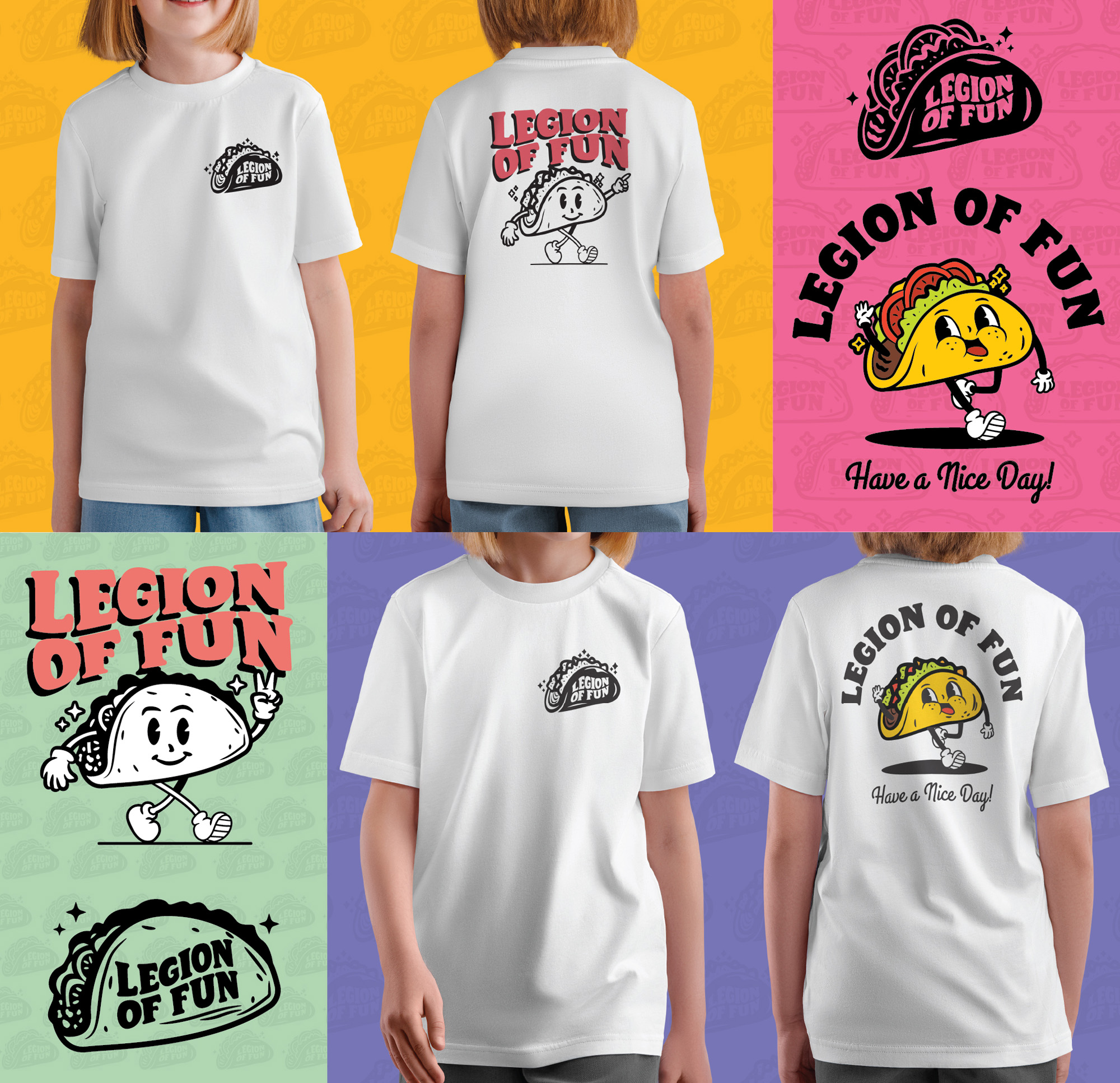
We crated two character designer for Legion of Fun to represent the playful surf vibe of the brand while incorporating the Main Taco Logo. The taco mascot brings the “Legion of Fun” vibe to life — playful, a little retro, and always down to party. Designed with bold lines and flexible poses, it works as both a front badge and a full back graphic. The taco character is at the core of the brand’s personality — playful, laid-back, and designed to bring some movement and attitude to the visuals. Whether he's walking, throwing up a peace sign, or just sitting pretty on a pocket, he keeps the energy fun without trying too hard.


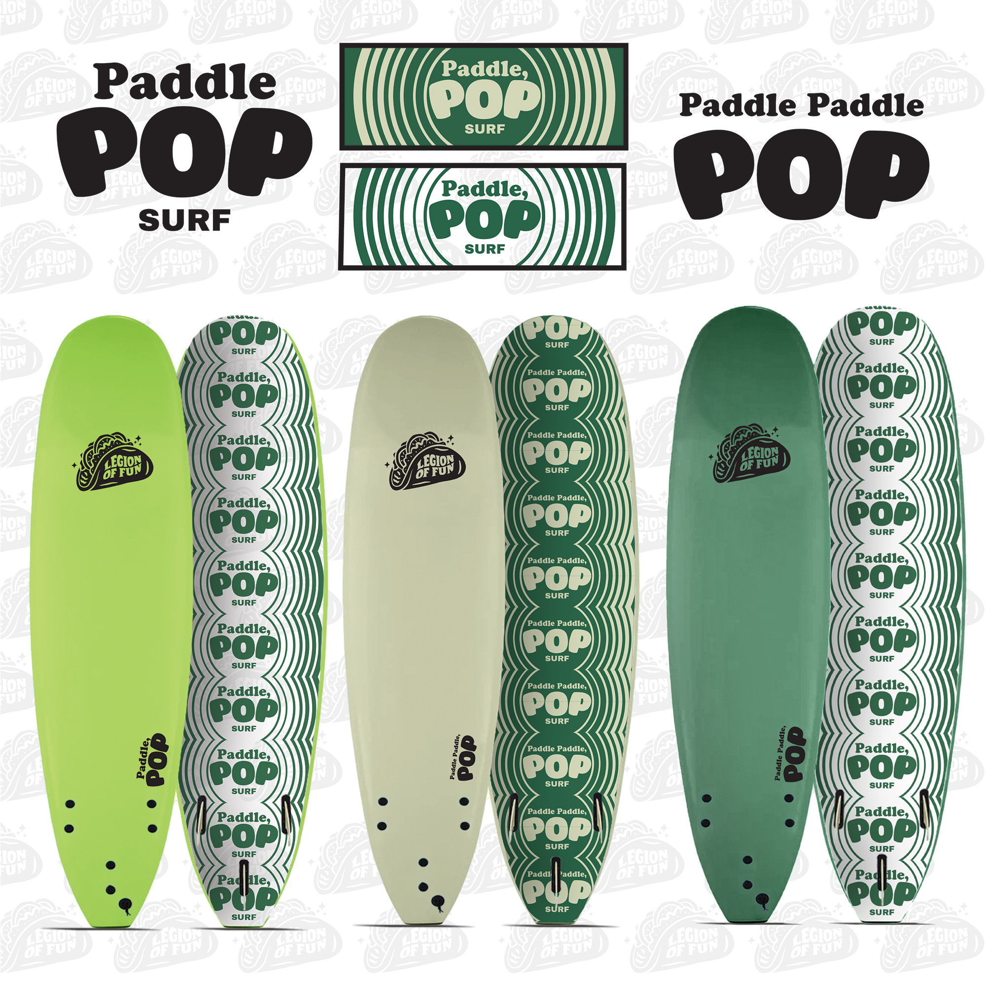


The team was tasked with creating all custom logos, board designs, and illustrations that align with the fresh new branding developed for Legion of Fun. Every element was designed to reflect the brand’s unique, playful personality, blending bold, energetic visuals with a laid-back, skate-inspired vibe. The custom board logos were crafted to stand out and evoke a sense of fun while maintaining versatility for various uses across the brand. Unique illustrations were created to complement each board design, ensuring they not only look striking but also embody the brand’s values of freedom, expression, and energy.
From dynamic character graphics to bold logo treatments, every detail was carefully considered to maintain consistency with the overall brand identity. The design process encompassed more than just logo creation; it involved crafting an entire visual language for the brand — from the board art to supporting assets like packaging, promotional materials, and apparel. Each piece was designed to be visually captivating on its own, while also working cohesively with other brand elements to create a strong, unified presence across all touchpoints.
By pushing the boundaries of traditional board design and infusing it with playful, modern aesthetics, the new identity for Legion of Fun connects with their audience on both a visual and emotional level.

© 2025. deadlydesignco. All rights reserved